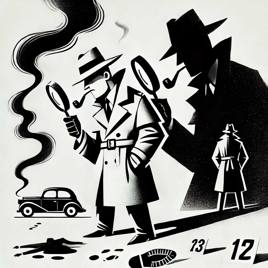
Picture this: it’s 2015, I’m three coffees deep, and a client drops a website in my lap that looks like a neon rave threw up on a Geocities template. Think lime green headlines, purple links, and—God help me—Papyrus screaming “Welcome” like a yoga instructor on a bender. I’ve been slinging code for 30 years, and this was the kind of mess that makes you question free will. But I didn’t flinch. I grabbed Helvetica, my trusty shovel, and started burying the evidence.
The Crime Scene: A Design Dumpster Fire
This wasn’t just bad design—it was a felony. The client, a small biz owner selling artisanal dog collars (because of course), thought “more color = more sales.” Spoiler: it didn’t. Their bounce rate was higher than a kangaroo on a trampoline, and I could hear the dial-up screech in my nightmares. They begged me to fix it, preferably yesterday, and I said, “Fine, but I’m not touching that Papyrus with a ten-foot pole.”
So, I cracked my knuckles, downed another espresso, and got to work. Step one: nuke the rainbow. Step two: unleash Helvetica like a SWAT team on a hostage crisis.
Helvetica: The Cleanup Crew
Look, I’m not saying Helvetica’s the sexiest font—it’s the missionary position of typography—but damn if it doesn’t get the job done. I swapped out the circus of fonts for one clean, crisp sans-serif. Suddenly, the site went from “flea market flyer” to “I might actually buy this.” The neon chaos? Gone. The purple links? Executed. Papyrus? Buried so deep even Indiana Jones couldn’t find it. I didn’t ask permission—I just did it, because 30 years gives you the right to skip the pleasantries.
The client blinked at the before-and-after like I’d performed an exorcism. “Where’s the flair?” they whined. I smirked and said, “Flair’s what got you a 404 soul. This is profit.” They grumbled, but the analytics didn’t lie: page views up, cart adds up, me smug as hell.
Typography 101: Don’t Be a Monster
Here’s the mini-lesson, because I’m not a total jerk—just mostly. Typography isn’t about picking fonts that “vibe with your aura.” It’s about clarity, hierarchy, and not making your visitors claw their eyes out. Three rules I’ve lived by since the Netscape days:
- One Font, One Boss: Stick to a single typeface (Helvetica, Arial, whatever) and tweak weights for contrast. Two fonts max, or you’re hosting a typographic orgy nobody RSVP’d to.
- Size Matters: Headlines at 24px or more, body text at 16px minimum—unless you hate your grandma and want her to squint.
- Color’s a Privilege: Black or dark gray on white. Neon’s for Vegas, not your checkout page.
I’ve rescued sites from worse than Papyrus—think Comic Sans on a law firm page—so trust me: simplicity wins. Helvetica’s my go-to because it’s neutral, legible, and doesn’t argue back. You want flair? Buy a peacock.
The Verdict: Case Closed
That dog collar site? It’s still kicking, raking in sales while I sip coffee in my PJs. Helvetica didn’t just hide the bodies—it framed the scene like a pro. Three decades of this gig taught me one thing: good design isn’t loud, it’s lethal. So next time a client hands you a neon nightmare, grab a sans-serif shovel and dig. Mercy’s optional—I didn’t use any.


0 Comments